
Search History
468551767
Custom Printable Alphabet Picture Learning Flash Cards
Playing card plastic
playing card
oracle
You May Also Like
Custom card printing · Factory guide
Holographic material can make a card deck feel collectible before a player reads a single card. The important work happens earlier: choose where the effect belongs, protect the information that must stay clear, and build the production file around the physical material—not only the screen mock-up.
For custom poker decks, board-game cards and tarot projects, holographic papers are more than a shiny upgrade. Their reflective surface changes how colours read, how small type performs and how the finished product is perceived in the hand. This factory guide explains the decisions that help an original design become a dependable printed deck.
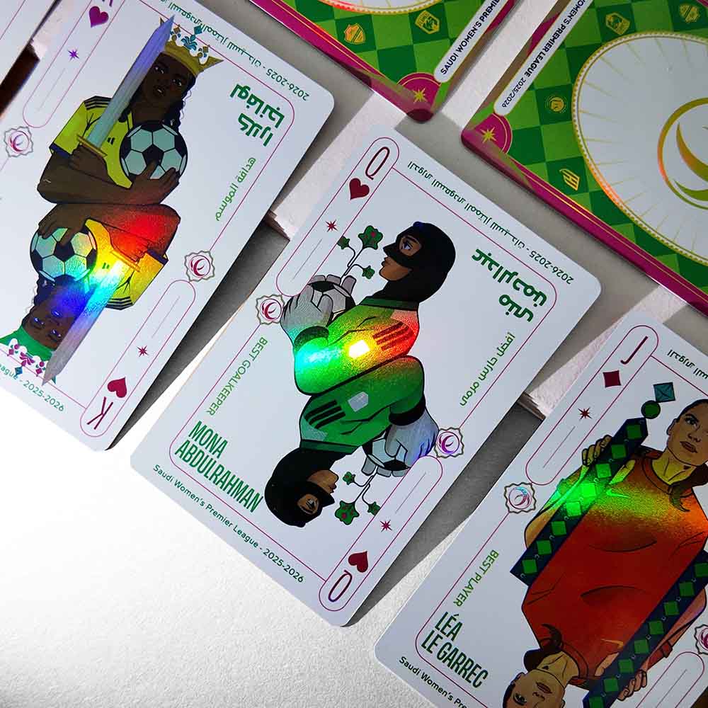
In card production, holographic paper commonly describes a paperboard or card stock paired with a micro-patterned reflective surface. Under changing light, that surface diffracts colour and produces a shifting rainbow, prism or dimensional effect. It is an optical effect: the apparent movement comes from the interaction between the textured surface and ambient light.
The relevant question for a creator is not simply whether the material looks striking. It is whether the effect supports the function of the card. Playing cards still need clear values and suits. A game card still needs to communicate information quickly. A tarot card must let its image and symbols lead. The best holographic treatment adds atmosphere and value without competing with those jobs.
A controlled holographic effect gives an edition a physical signature. It can distinguish a limited release, turn a rare-game-card marker into a tactile premium cue, or give a custom poker deck a more considered retail presence. Its value comes from contrast: reflective elements are memorable because the layout leaves room for them to breathe.
Use a special finish to differentiate a deluxe deck, bonus card or limited release while keeping the core game system unchanged.
Carry one material idea across cards, tuck boxes and inserts for a more coherent unboxing experience.
Let reflective areas reinforce motifs already in the art: starlight, water, smoke, magic, armour or a brand pattern.
There are limits. A highly reflective area can reduce perceived contrast under warm indoor light and can make densely detailed art feel busy. Treat a sample as part of design development, not as a final box-ticking exercise. It is the reliable way to inspect the deck at a natural playing or reading distance.
A reflective surface is visually active underneath every transparent printed colour. Without a planned opaque layer, a colour may pick up metallic character from the material below; pale art may feel less solid; and tiny reversed text can lose clarity. The practical choice is to decide which areas should display the holographic base and which need a controlled printed ground.
White ink placed beneath selected artwork creates a more stable, opaque surface for the colour layer above it. Where the white layer is deliberately omitted, the holographic base remains visible through the printed colour. That contrast gives the project a useful vocabulary: solid illustration where information or accurate colour matters, and reflective movement where the design can use it.
In a production file, this commonly means supplying a separate, clearly named white-ink or mask layer. Always work from the printer’s current template and layer convention before final artwork is built.
Keep ranks, pips, game icons, rules text and key tarot titles on stable, high-contrast areas. The finish should never become a reading obstacle.
Holographic areas are often strongest as borders, symbols, light rays, patterns or intentional negative space—not as a treatment for every part of the layout.
Mark white-ink and effect zones on separate editable layers, following the supplied template. Do not rely on a visual note embedded in the artwork.
Inspect at multiple angles and under ordinary light. Check legibility, registration, colour behaviour and consistency across a practical range of cards.
| Effect coverage | Will the holographic appearance cover the entire card, form a pattern field, or be limited to marked details? |
|---|---|
| Colour control | Which images need white underprint, and which areas should intentionally reveal the reflective base? |
| Card function | What values, symbols or text must remain easy to read in low or mixed lighting? |
| Handling target | Will the deck be shuffled regularly, displayed as a collectible, or used at a board-game table? |
| Packaging role | Should packaging repeat the effect, or should it provide a calmer contrast to the deck? |
For a poker deck, the production risk is functional: ranks, suits and indices must be immediately readable. Holographic treatment tends to work well on the card back, court-card accents, jokers, ornamental borders and selected face details. If a card face is broadly reflective, build extra contrast around the indices and examine the proof under the lighting in which the deck will actually be played.
A custom card game printing project often carries icons, ability text, resource values and faction signals. Treat the holographic zone as part of the visual hierarchy. A practical approach is to reserve it for rarity marks, faction crests or a focal illustration while keeping text panels on a quiet, opaque ground. Players receive the premium visual cue without having to work harder during play.
In custom board game printing, holographic papers can appear beyond the deck: on special-event cards, player aids, a limited-edition sleeve or a small premium component set. Think about the complete table experience. A surface that looks dramatic while unboxing can be distracting under an overhead lamp. Restrained repetition on the special components often feels more refined than applying the effect everywhere.
Custom tarot cards can use reflective areas to support starlight, moonlight, water, halos or gilded architecture. Yet tarot is first an image-led reading experience. Keep the central figure, symbolic objects, card number and title dependable at a glance. For custom tarot cards printing, review the proof both close-up and at natural reading distance, as the deck will be held in use.
“I want rainbow cards” is a useful starting conversation, but it does not give a manufacturer enough information to recommend a construction or flag artwork issues. A concise, specific brief produces a more comparable quotation and a more meaningful sample.
Reference images can communicate a mood, but they should not be used as a request to reproduce another company’s protected artwork, logos or trade dress. A strong deck becomes memorable by translating its own original art direction into material choices.
No. It performs best when the artwork has a clear visual hierarchy and the effect has a deliberate role. Dense rules text, tiny labels and low-contrast illustration need careful white-underprint planning and proof review.
No. A screen can suggest the effect, but the finished material responds to its lighting environment. Review a physical sample or approved proof under more than one lighting condition before confirming a production run.
Often, yes. Projects can use separate white-ink and special-effect masks to distinguish reflective areas from opaque artwork. Request the current artwork template and file setup guidance before starting final production art.
The effect itself is aesthetic. Deck durability comes from the complete construction: stock, coating or lamination, edge treatment and expected handling. Confirm the performance requirement for your intended use.
Include card count, size, order volume, delivery location, artwork status, desired coverage, packaging requirements and target date. These details enable a project-specific material and production recommendation.
THRIWA supports original playing-card, card-game, tarot and board-game projects with a clear production brief, artwork guidance and project-specific quotation.
Request a Custom Quote


